
Data visualization is a fantastical combination of data and design work; it takes information and presents a story in a way that is both easy to understand and pleasing to view. Each one is like a fingerprint. It’s unique – tailored to fit the requirements of the project, and it’s beautiful in its own right.
Shown below are two very different visualizations, meant to show two very different sets of data. The former is showing only quantitative data, while the second visualization is a display of both qualitative and quantitative data.

Where Did It Start?
The brief I received for the first project was to create a visualization using statistical data to find and display an interesting trend present in the dataset. This particular visualization used a few sets of data of my choice – the price of quinoa, the amount produced (both by country, and globally) and the number of times it was displayed on webpages, per year. Once the subject of my visualization was determined, I could continue on into deciding how to tackle the project.
I Have My Data: Now What?
The nature of the data helped narrow down the type of graph that was appropriate for the situation. Since it dealt with data over a period of time, the first step was to see all of the chart types that deal best with that format of dataset. From there, the list of potential visualizations was further narrowed down by the other requirements – patterns in the data needed to be marked out clearly, and it was essential that the data points be easy to compare to one another. This ruled out visualizations that only deal with events over time, such as a timeline, calendar or timetable. Additional information was added by including elements such as callouts, and using colour to represent an additional metric rather than adding a completely separate visualization.
From Basics to Beauty
This visualization was also created with Ann Emery’s and Stephanie Evergreen’s data visualization checklist in mind. It’s a handy checklist to run through to see if there are any areas where a visualization could be less cluttered, or generally easier on the eyes – not every step is applicable every time, but it’s a good baseline to start at when reviewing. As this was created for a print format document, it had to be legible when printed (whether in black and white or in full colour) and had to be understandable for the viewer without someone else there to explain it.
To avoid issues when displaying two separate scales between the measurements shown in quantity of quinoa, and the quantity shown of the Google results, these were completed in two separate styles that were connected by a cohesive colour scheme. These give them the tie to make them seem as one cohesive visualization, while not sacrificing the structure required for it to remain legible.
Round Two: A Second Start
Some of the same principles apply to this second visualization. Colour still plays an important factor; it has to work in greyscale and it should be checked to be viewable by individuals with colour deficiencies.
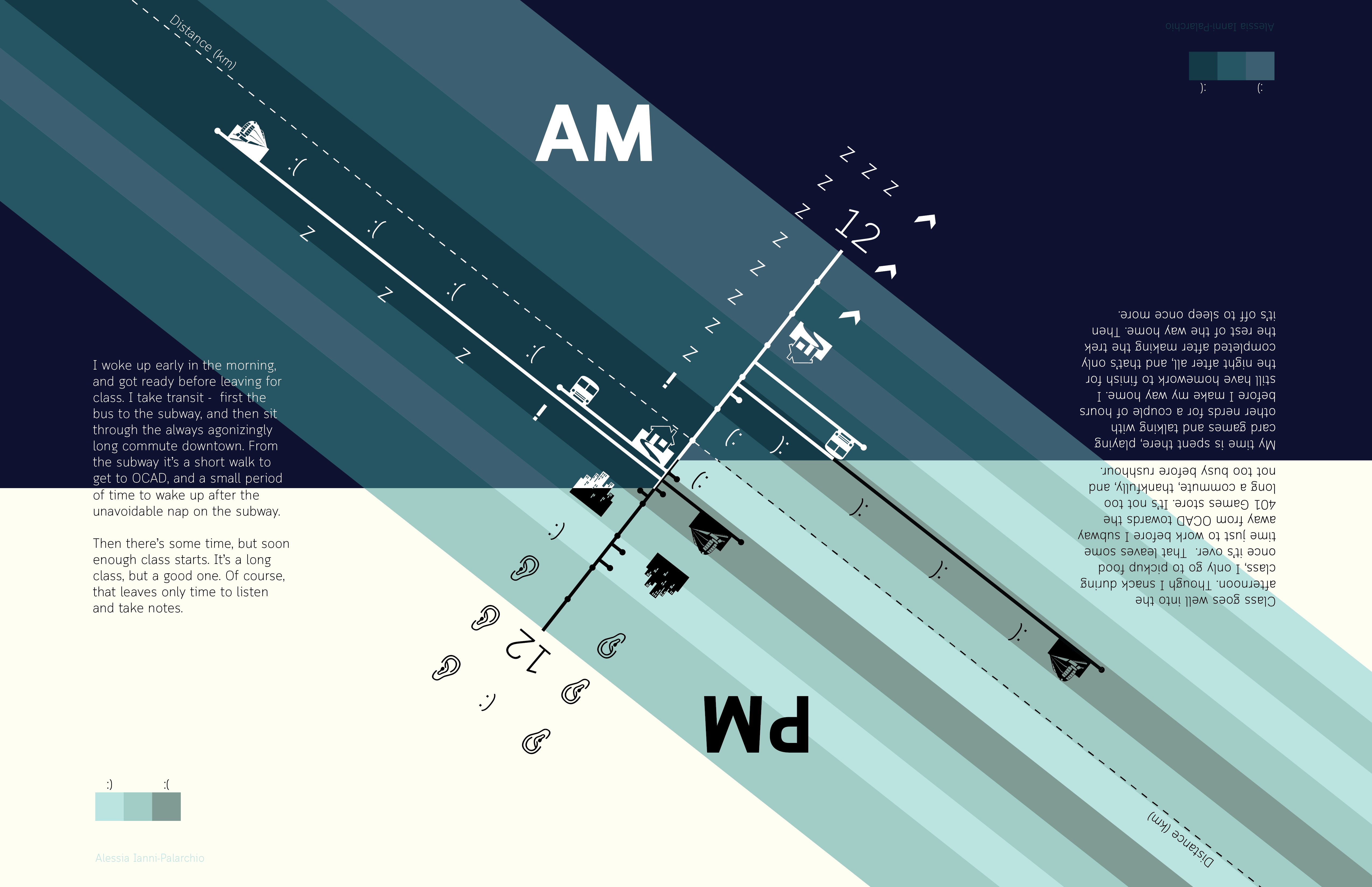
Differences lay in the choice of structure instead – this second visualization is partly based on qualitative data in the form of ‘mood’ over a period of time, as recorded by myself. This is compared to the activity that was being done in that moment, as well as the quantitative distance traveled.
Just like the last visualization, this one is still focused on a period of time, but it is also focused on the specific events and the order they occurred in. This made a timeline applicable, since the focus is on the chronological events first and foremost, with the rest of the information being secondary.
In this instance, the numerical values portrayed were less important than the feeling of the visualization, which allowed for something more abstract and whimsical. Constraints I received in the brief for this piece included the restrictions that only two fonts could be used, and it could only be created with geometric shapes as an addition. Restrictions like this are an aesthetic limit to work around. This is what drove the stylistically more minimal approach to this visualization, rather than take an illustrative look to the piece.
The Big Picture
What both of these share in common is the form factor came first for both of them. The colours and layout came after the initial decisions of which type of graph worked best for each story. These are ultimately determined by the type of data you have on hand, the project restrictions, and the story you want to tell. From here, the chart type becomes the solid foundation on which the rest of the visualization is built upon. This can also end up forcing you to be more creative when keeping in mind basic design principles to be able to create something that is both visually stunning and informative to the viewer, telling them the story you want to tell.