
 Over the past several weeks and recently at MicroStrategy World I’ve been involved in conversations where we reviewed different types of data visualizations and what value can be derived from them. While many people who request visualizations want something flashy that seems to answer their question, my reaction more often than not when reviewing the insight provided is, “So What?”
Let me share an example: weather data on a map for a retailer. Project X sells both our geospatial analysis tool GeoDash and a weather data feed separately, and many people question why we don’t currently have weather as a layer type built into GeoDash.
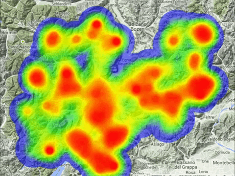
If you ask many business users how they’d like to make use of weather data, they’ll often say they want to show the concentration of precipitation as a heat map over their stores, or little rain and snow icons. We have had many customers who were so excited for us to display weather data on a map, so we did, but once we did we realized that while showing an amorphous display of temperature or precipitation may look pretty, it doesn’t answer anything related to location of stores, customers, profit or revenue. The “So What.”
In discussing this with the clients, we generally agree that while it is nice to show weather visually, the real value is when you use this layer as an identifier of trends or outliers. So, if you now make that weather data a filter on your performance data you can identify how the weather impacts your sales using charts and graphs, and compare the forecast to past performance to make predictions.
“Why are Sales up 20% this weekend over last year? Was it related to weather or other factors?” By tapping into historical weather data, you can easily gain some context if this boost was weather related or not, but the more powerful application would be to create a normalization algorithm on your sales data. This would allow you to scrub any redundancy in the data related to the weather, allowing the business to dig deeper into other performance factors.
Weather, maps and other visualizations are meant to be connect highlighters. When used properly they will lead you the “So What?” When used wrong, they are just pretty pictures that demand too much action to allows you to discover true insight.
For more of our insights from World 2017, visit our World summary page.