
At Project X we are passionate about data, and are continually inspired by the creative ways data scientists and artists make large data sets accessible to the public at large. With the new year having just begun, we want to take this time to reflect on our favourite data visualizations of 2016.
Dear Data
Visualizations that helped define a friendship
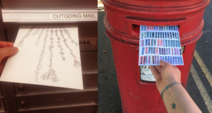 Information designers Giorgia Lupi, an Italian living in New York, and Stefanie Posavec, an American living in London, met at the annual EyeO Festival and started corresponding through weekly data visualization postcards related to their habits. Touching on everything from smartphone usage to daily purchases, these beautiful postcards are an intimate portrait of the development of a long-distance friendship and how data visualization can add a layer of beauty to the mundane. The Dear Data project is now a book, and the entire collection was recently acquired by MoMA in New York City.
39 Studies About Human Perception in 30 Minutes
Humans look at graphs and charts with inherent bias for symmetry and other fun facts
Kennedy Elliott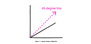 , a graphic designer for The Washington Post, wrote this fascinating speech for OpenVis 2016 in which she describes the challenges of creating visualizations that won’t be misinterpreted by viewers. Starting with the idea that visualization is both a science and a language, Elliott delves into the many studies on how people perceive different shapes and lines, and the many biases and distortions human viewers prescribe them.
XKCD
XKCD would make our list every year
 For those of you data folks living under a rock, XKCD is an ongoing webcomic self-described as “A webcomic of romance, sarcasm, math, and language” by Randall Munroe. Munroe, a former NASA employee turned full-time webcomic artist, writes about many things, and often creates his own factual yet tongue-in-cheek data visualizations. Some of our favourites from 2016 include “Things You Learn” and “A Timeline of Earth’s Average Global Temperature.”
Earth – An Interactive Visualization of Weather Conditions
Ever wonder what the wind speed and temperature is in Hokkaido?
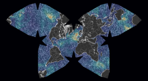 Having created a wonderful tool you can get lost in on your break at work, Tokyo-based Cameron Beccario is one of our heroes. His Earth visualization is a forecast of global weather conditions updated every three hours on a scalable and rotatable 3D render of our planet. Selectors allow you to view different patterns including wind and air temperature, ocean currents and waves, CO2 distribution, and even the shape of map. This one was created in 2013 but we only discovered it last year!
Gender Pay Gap
Data Visualization Used to Highlight Inequality in Society
 Created by DataViz rockstar David McCandless, this interactive graph highlights the pay disparity that still exists between male and female employees in both the U.S. and U.K. based on the latest statistics available. Data visualizations used for social justice purposes are a tremendous way to help inspire change.
Challenge of The Parent of A Newborn
The rhythms of a newborn infant’s sleep, visualized
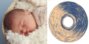 Last but not least, and published right on the cusp of 2017, Australian Reddit user “andrew_elliott” posted a spiral visualization representing his newborn daughter’s sleep patterns over her first 6 months. The effect is mesmerizing and a testament to the challenge of raising a child. He’s currently planning to cut the pattern into a piece of timber and making it the back of a clock as a future present to his daughter.
Any of your favourite visualizations missing from this list? Start the conversation in the comments below or tweet them out to @ProjectXLtd.