We here at Project X Ltd. love data, though we have to admit that raw data is not particularly relevant to the layperson who can’t make sense of it. It’s for this reason that data storytelling is becoming a hot topic for data analysts who need to be able to communicate their findings to the public and stakeholders in a way that adds additional potency to their data.
While it’s well known that data dashboards and visualizations can help decision makers see patterns in their data that might not otherwise be apparent, many organizations are struggling with how to take their data and present it in a way that can tug at heart strings and sway opinions to help further their cause. As data analysts are not trained explicitly to do this in school, the ones who tell the stories are often the marketers and designers who make sense of the myriad number of figures and charts and know how to spin a narrative surrounding it. When done well, creative and interactive visualizations can say more than the raw statistics powering them ever could.
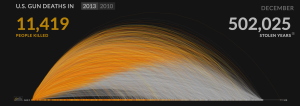
One poignant example of a gorgeous yet thought-provoking data visualization is this animated chart by Periscopic. It showcases the estimated natural age of death for U.S. citizens killed by gun violence, with the orange section of the line representing the age they actually lived to before they were shot. As the lines quickly overlap as time progresses throughout the year of 2013 and the number of “stolen years” ramps up, it becomes quickly apparently how systemic gun violence is in the U.S. Each line on the chart even links to the actual news report of that death, further deepening the humanity in the numbers.
In another example, the Institute for Health Metrics and Evaluation (IHME) designed an interactive dashboard that tackles the stigma of obesity across the globe. This series of graphs make it easy to compare the obesity rates in different countries globally, and highlight areas where obesity is unfortunately high, or on the other end, hunger is rampant.
Both of these visualizations are easily shareable, and their interactive nature allows the public to delve deep into the data and become more intimately aware with the issues that they’re meant to showcase.
Of course, not every creative data visualization is on a screen. Consider this Forbes report about a dress made out of a United Nations High Commission for Refugees (UNHCR) refugee tent that is currently on display in the Science Museum of London. More than a dress, this project designed by Professor Helen Storey in conjunction with creative technology agency Holition has 80,000 points of light projected on it representing the movement of refugees around the globe. With each light representing 100 people, that’s one dress representing the plight of 8,000,000 refugees – a powerful data-driven image. What’s more, the blending of high fashion with data tells a story in a way that captures the public’s imagination and sparks important discussion:
“Worldwide, one in every 113 people on the planet is now either a refugee, internally displaced, or seeking shelter,” relates Storey, “but numbers means nothing, if they don’t affect your own heart. This project uses the power of fashion to help us connect to the previously unimaginable and asks how each and every one of us can remain a humanitarian in such a time of colossal and irreversible change.”
Statistics have always been used to make a point, but these artistic visualizations show that it is possible to tell a story that will help capture the public’s imagination in a way that sheer numbers never could. While all of these projects are made using a static database of numbers portraying a specific time period, there’s nothing stopping an organization from designing artistic, storytelling visualizations that can update in real time using your live data – after all, there’s a 3D globe you can view online that displays weather patterns and regional CO2 levels updated every three hours. All you need is the right BI partner and creative ideas.
Marketing Assistant
Project X Ltd.
Image Credit: Dress For Our Time (David Betteridge)


